Advanced Typography - Task 3 (Final Project)
07.6.2021 - 03.7.2021 (Week 11 - Week 14)
Jocelin Agustia (0345436)
Advanced Typography - Bachelor of Design (Hons) in Creative Media
Final Project - Type Exploration and Application
INSTRUCTION
Module Information Booklet
Week 11 - Week 14
We have finally reached our final project and we were assigned to:
Develop a font that is intended to solve a larger problem or
meant to be part of a solution in the area of your interest be it
graphic design, animation, new media or entertainment design
or any other related area not necessarily reflecting your
specialisation.
or
Explore the use of typeface in your area of interest, understand
its existing relationship, identify areas that could be improved
upon, explore possible solutions or combinations that may add
value to the existing typeface.
I had a lot of thought about this project and decided to make a typeface for Lays, here is my proposal:
figure 1.1 Final Project Proposal
So without further ado, I started searching for chips reference and sketched.
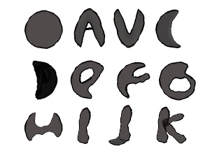
figure 1.2 Alphabets Sketches
After that, I imported the sketches to Adobe Illustrator and traced them one by one using the pen tool, it is not a long process as the lines don't have to be precise because I was trying to achieve the irregular form.
figure 1.3 Traced + Modified Alphabets
But then I realized that I only have 24 alphabets and the letters missing are S and T. So, I quickly made them directly in Illustrator. The letter 'S' was made from the letter Z, it was only adjusted a bit, while the letter 'T' is made from the formation of 2 letters 'I'.
figure 1.5 Complete Alphabet Reference
I saw that the letter 'L' looks weird, as it feels thinner than the rest so I made a little adjustment to it.
figure 1.6 Adjusted Letter 'L'
After the fixing, it's time to move on to the punctuations. I decided to go with (!), (,), and (.) as they were needed for my poster.
Lastly, we need to generate our font. Since my font is a display type, I needed to have them colored and I found some programs that could do that, such as FontCreator and Fontself. But Fontself needs a subscription so I decided to go with Fontcreator since it has a trial version. It all started fine, but then it wouldn't generate.I was recommended to use Birdfont by my friend and it worked! Although I need to simplify the points from the original one, so it looks a bit different from the reference.
figure 1.8 Final Font (Simplified)
figure 1.9 Final Font PDF
figure 2.1 Final Font View from Birdfont
For the sake of similarity to the reference, I created a custom scatter brush for the seaweed sprinkles, and it can be downloaded here: Seaweed Brush
Application
I decided to apply the fonts to a poster for Lay's, here are some headlines I found for the poster:
- Lay it on me, Baby!
- More chips, more love!
- Guess that flavor!
- Keep deliveries crisp.
I decided to use the third one, "Guess that flavor!" for the poster because it was the official one I found on Lay's page. Before that, I searched for references online.
figure 2.3 Final Poster JPG
figure 2.4 Final Poster PDF
I was told to make the poster just by putting in the headlines and the Lay's logo, but after trying it found it seems a bit plain and since its an advertisement poster, I thought it'll be better if there are chips/the products in the poster, thus I added in the chips and minimized the logo.
figure 2.5 Final Poster Mock-Up JPG
figure 2.6 Final Poster Mock-Up PDF
FEEDBACK
Week 12
Instead of designing it for the logo, it's better to design it for headlines so do some research on Lays advertisements. Overall, it is very consistent.
Week 13
Keep the letter I as it is, adjust the letter L to thicker, and try applying it on the poster with only the headlines and Lay's logo.
Week 14
You don't have to generate a colored version, just have it black and white both for generating and the headlines. You can provide the brush for the sprinkles.
REFLECTION
When we were told that the final project is a free topic, I was really excited. I thought of a whole bunch of things and eventually ended up with Lay's, a potato chip brand that I love so much, especially the nori flavor! I thought that designing a font out of chips would be fun and challenging because it needs to look like a chip and reminds you of how tasty chips are.
During the process of making the font, I struggled a lot, especially when generating them as a useable font. At first, I thought that I could just convert them just like how I did in semester 1, but then again, my type of font is a display font and it has colors on it. So, I searched alternatives and found a program called Fontcreator, everything was working well but when it's time to generate them, the colors won't show at all.
Later, I tried using Font Forge but I can't find the way to put in colors, so I contacted Sir Vinod and he told me that it's okay to have the font in white and black so I continued on it. But later, I stumbled on a problem again, there were errors with my SVG so I can't convert them. My last resort is to use Font Bird that I heard from my friend, it really does save me! And it was very easy to use, although I had to simplify my font in the end, because the SVG was too heavy.
FURTHER READING
Since we had to use a new program to generate our font, one of my peers in class gave us a website on a tutorial to use Fontforge.


Comments
Post a Comment