Advanced Typography - Task 2A & 2B
26.4.2021 - 31.5.2021 (Week 5 - Week 10)
Jocelin Agustia (0345436)
Advanced Typography - Bachelor of Design (Hons) in Creative Media
Task 2A & 2B (Key Artwork, Animated Poster, and Collaterals)
INSTRUCTION
Module Information Booklet
Task 2A: Key Artwork
Week 5
Before starting with our project 1A, we had a discussion regarding the event we'll be using. Here are the choices:
- Russian Constructivism
- Bauhaus
- Punk Influence on Graphic Design
- Sophie Taeuber: Living Abstraction
- RIUH
- Urbanscapes
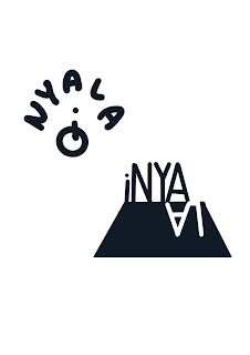
I decided to go with the urbanscapes event since I thought it would be very interesting to work with, there are lots of event inside Urbanscapes and decided on iNYALA. It's an event that works with lights and they are very interesting. However, I don't really know whether we could use the event inside Urbanscapes or use Urbanscapes directly, so I made 2. Before that, searching for inspirations is a must.
figure 1.1 Inspirations
figure 1.2 iNYALA Sketches
The concept for this key artwork is to play with lights, the one on the left takes the form of a butterfly since at iNYALA there's this one project that requires electricity to power up the cocoon and once its light up the butterfly will follow along.
figure 1.3 iNYALA Key Artwork
Next, I made the Urbanscapes key artwork directly on Adobe Illustrator. It was inspired by the building from figure 1.1, the idea was to use the windows of the buildings.
figure 1.4 Urbanscapes Key Artwork
Week 6
After the feedback session, I made more adjustments to the key artwork, I made 5 variations of them. But, after I showed these to the lecturers I still need to make adjustments.
figure 1.5 Adjustments
Week 7
I still stick with my earliest concept which is to use the buildings to depict urban but I then used another element which is the bridge from Urbanscapes poster, to indicate how the event brings people together to show their creativities.
figure 1.6 Final Key Artwork JPG
figure 1.7 Final Key Artwork PDF
Task 2B: Poster and Collaterals
Week 8
(Independent Learning Week)
Since its ILW, we don't have class but we still have to work on task 2B: Animated poster and Collaterals. But we don't need to have it animated first. Here are what I made:
figure 1.8 Poster
Week 9
After the feedback session, I made changes to the poster, there are 3 variations:
figure 1.9 Revised Poster
In the end, I decided on going with option 3 after getting some feedback from my friends.
figure 2.1 Final Poster JPG
figure 2.2 Final Poster PDF
Week 10
Now it's time to animate the poster. Firstly I find references online and there is this account in Instagram that I find ispirations from: @_kickin_
figure 2.3 Inspiratins from Pinterest
For the animation, I firstly seperate the all the layers in Ai then moved the to After effects and adjust what I wanted to animate. I don't really have any sketches for what I aim for the animation because I directly imagened them and go with the flow while animating.
We were told that we only need to have 2 collaterals since the time won't be enough, but we are still welcomed to make 3. So, I made 3 collaterals:
figure 2.6 Urbanscapes Tickets
figure 2.7 Urbanscapes Pen
figure 2.8 Urbanscapes Name Card
After the feedback session I decided to make new ones, which is drinking can and signage. The reason why I use drinking can is because of the thought that every event must have a food/drink stand.
figure 2.9 Urbanscapes Drink Can
figure 3.1 Urbanscapes Signage
So the final chosen one is the tickets, can, and signage.
figure 3.3 Final Collaterals PDF
FEEDBACK
Week 6 (Peer Feedback)
- The 6 boxes work well maybe they could be used throughout this project
- the stroke that forms the box which contains the letter A is not really necessary because the form of the box can still be seen.
- Need some work because it currently looks rigid but it does depict urban.
- Have something to specify the windows
- The idea of using windows and the dot don't really work well as it doesn't depict the event since the events were all about being outdoors and creative arts.
Week 9
- Extend the lines until out of the poster then adjust the texts below
Week 10
- The animation has direction and well done
- Tickets have good alignments but the other 2 collaterals don't reflect the event so changes must be made.
REFLECTION
During the process of making key artworks, I actually struggled a lot because I can't seem to find ideas for the event, it may be because I don't really know well regarding this particular event. After lots of adjustments, I finally came up with the key artwork I'm satisfied with, although it takes a lot of time.
When doing the animations and collaterals, I had a lot of fun especially when making the collaterals, I find it exciting to apply my designs to collaterals.
FURTHER READING
What I sum up from this article is that key artwork is like the mascot of the brand that is used to communicate with users. It is something that really attaches firmly to the mind of the users regarding a particular brand.


Comments
Post a Comment