Advanced Typography - Task 1 (Exercises)
29.3.2021 - 02.5.2021 (Week 1 - Week 5)
Jocelin Agustia (0345436)
Advanced Typography - Bachelor of Design (Hons) in Creative Media
Task 1 - Exercises (Typographic Systems and Type & Play)

LECTURES
Advanced Typo_1 - Typographic System
Typographic System
For designers, it is important to communicate the purpose of our design. Hierarchy, order of reading, legibility, and contrast are also part of the importance.

figure 1.1 Typographic System
There are 8 variations of the Typographic System:


figure 1.2 Axial System
Axial: Organized to the left or right of the axis. Usually applied for 1 axis only.


figure 1.3 Radial System
Radial: All elements are extended from a point of focus and spread out according to the point of focus.

figure 1.4 Dilatational System
Dilatational: Expand from a central point circularly with multiple rings of circles on either side constructing hierarchy.


figure 1.5 Random System
Random: Appear to have no specific pattern or relationship.

figure 1.6 Grid System
Grid: Vertical or horizontal divisions.

figure 1.7 Modular System
Modular: Informal system of layered banding segregating information within certain bands.
Transitional: A series of non-objective elements that are constructed as standardized units.

Bilateral: All text arranged symmetrically on a single axis.
Things to pay attention to:
- Avoid extreme diagonal cut (e.g; 45°) as it is not easily digestible
- Avoid 1 side colorization, it creates too much contrast
- Avoid imbalance (e.g; Heavy on the left but light on the right)
- Avoid highlighting with bright colors
- The axial system requires branching from the line thus texts out from the axis shouldn't be applied. The same goes for 2 different texts that are not related to each other.
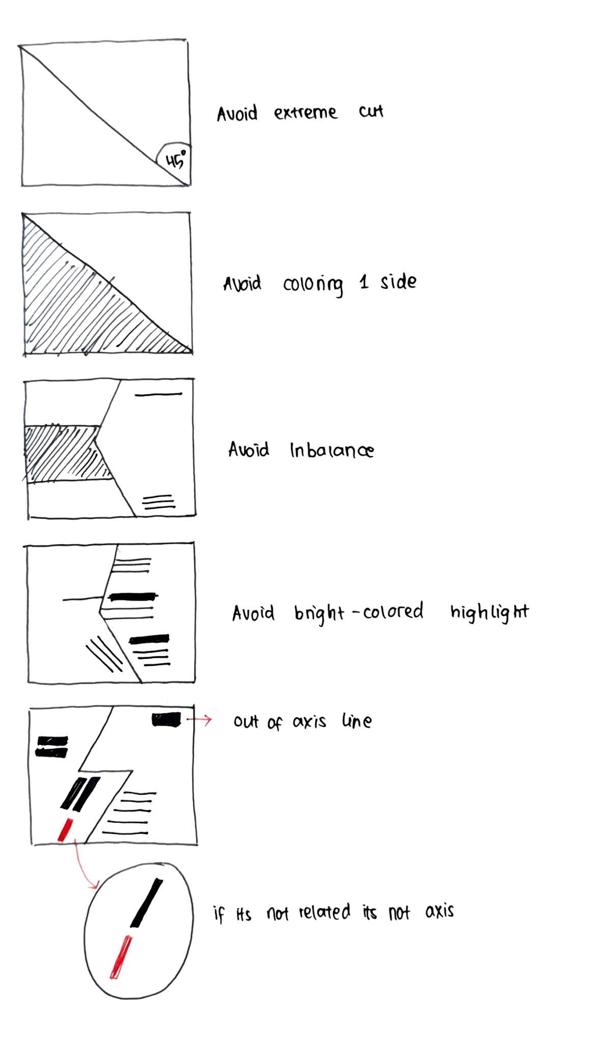
figure 2.1 Things to pay Attention To
Principles of Design Composition
Typographic Systems
The most often used system is the Grid System which is derived from the grided compositional structure or Letter Press printing, and further enhanced by what is now to be termed as the Swiss (Modernist) style of typography. Proponents: Josef Muller Brockmann, Jan Tschichold, Max Bill, etc.

figure 2.2 Grid System
Then the era of Post-modernist was born where randomness and asymmetry were explored. Proponents: David Carson, Paula Scher, Jonathan Barnbrook, etc. There was madness to their method since the order was replaced by apparent chaos but this chaos was exciting and new. And so, the symmetry, random, repetition, dilatational, and radial systems began to take root.

figure 2.3 Left to Right: Paula Scher, Jonathan Barnbrook, David Carson
Oder Models/Systems
Environmental Grid
Based on the exploration of n existing structure/numerous structures combined (Extractions of curved and straight crucial lines).

figure 2.4 Example of Environmental Grid by Brenda McMannus
Based on the exploration of an existing Grid System to get students to explore the multitude of options the grid offer, to dispel the seriousness surrounding the application of the grid system, and to see the turning of pages in a book as a slowed-down animation in the form that constitutes the placement of image, text, and color.

figure 2.5 Static Versions of Form
Advanced Typo_3 - Context and Creativity
Handwriting
The first mechanically produced letterforms were designed to directly imitate handwriting. Thus, it would be the basis or standard for form, spacing, and conventions mechanical type would mimic and try.
Shapes and lines of hand-drawn letterforms are influenced by the tools and materials such as sharpened bones, charcoal sticks, plant stems, brushes, feathers, and steel pens all contributed to the unique characteristics of the letterform.

figure 2.6 Evolution of Latin Alphabet
Cuneiform (c. 3000 B.C.E)
The earliest system of actual writing was used in a number of languages between the 34C. B.C.E. - 1st Century C.E., written from left to right. It can be distinct from its wedge form. The Cuneiform characters are evolved from pictograms.


figure 2.7 Left-Right: Wedge Form of Cuneiform, Pictograms of Cuneiform
Early Greek (5th C. B.C.E.)
Consists of 22 letters that were built on the Egyptian logo-consonantal system. Was then adopted by the Greeks who added the necessary vowels. Early Greek was compromised of only capital letters written between two guidelines to organize them into horizontal rows. The reading formation of the Greek was from left to right ("As the Ox Plows"). Thus, one row would be read left to right and then switch from right to left.

figure 2.8 Early Greek (5th C. B.C.E.)
The characteristics of early Greek letters were: drawn freehand, not constructed with compasses and rule, and had no serifs — neither the informal entry and exit strikes left by a relaxed and fluent writer nor the symmetrical finish stroke typically added to letters by formal scribes.
However, as time pass the strokes of these letters grew thicker, the aperture lessened, and serifs appeared, so they were used for inscriptions served as models for formal lettering in Imperial Rome. Those inscriptional letters were written using a flat brush, held at an angle like a broad nib.

figure 2.9 Roman Uncials
by the 4th Century, Roman letters were becoming rounder which allowed the curved form to have lesser strokes and could be written faster.

figure 3.1 English Half Uncials (8th Century)
In England, the uncials evolved into a more slanted and condensed form. While English and Irish uncials evolved, writing on the European continent devolved considerably and needed a reformer, luckily, it came in the Carolingian handwriting Reform.

figure 3.2 Emperor Charlemagne (8th Century CE)
The fall of the Roman Empire resulted in general illiteracy and breakdown of handwriting into diverse regional styles. The knowledge of handwriting was kept alive mainly in the remote outposts of religious cloisters and retreats for 300 years.


figure 3.3 Carolingian Minuscule
During Charlemagne's patronage book production increased and language was standardized —pronunciation and spelling as well as writing conventions — capitals at the start of a sentence, spaces between words and punctuation. Hence, a new script emerged, the Carolingian minuscule, and it was used for all legal works to unify communication between various region.

figure 3.4 Black Letter (12th - 15th C. CE)
Gothic was introduced as the culminating artistic expression of the middle age from 12th - 15th C. CE. Originated with the Italians that refer to rude or barbaric cultures north of the Italian Alps. This gothic spirit especially took hold in France, Germany, and England with manifested unhindered upward striving: the vertical supplanted horizontals as the dominant line in architecture; the pointed arch replaced the round arch of the Romans; the almond shape, or mandorla.

figure 3.5 Characteristics of Black Letter

figure 3.6 The Italian Renaissance
Humanist scholars in Italy slowly revive the culture of antiquity. The renaissance embrace of Ancient Greek and Roman Culture suppered a creative wave through Italian art, architecture, literature, and letterform design.


figure 3.7 Antica
Humanist named the newly rediscovered letterforms, Antica. The renaissance analysis of form that was being applied to art and architecture was directed toward letterform, resulting in a more perfect or rationalized letter.

figure 3.8 Moveable Type (11th - 14th Century)
Woodblock had already been practised in China, Korea, and Japan and the earliest known printed book is the Diamond Sutra: 16' scroll with the world's first printed illustration. China had attempted the use of moveable type for printing but was unsuccessful due to the number of characters and the material used which was clay.
Several decades before the earliest printing in Europe, Koreans established a foundry to cast moveable type in bronze that allowed the dismantling and resetting of the text. With their new script called Hangul, the Koreans would succeed where the Chinese failed.
To summarize, the moveable type was introduced in the 1000-1100 CE which was pioneered in China but achieved in Korea. In late 1300-1399 CE, several decades before the earliest printing in Europe (Guttenberg's bible 1439), the Koreans establish a foundry to cast moveable type in bronze.


figure 3.9 Movable Type (China - Korea)

figure 4.1 Evolution of Middle Eastern Alphabets
While the Phoenician letter marks a turning point in written language, use of sound represented in letters, the script itself has been possibly influenced by the Egyptian Hieroglyphics and Hieratic Scripts.

figure 4.2 Evolution of the Chinese Script
From the oracle bone to Seal script to Clerical Script, Traditional and simplified scripts.


figure 4.4 Indus Script Seals
The oldest writing found in the 'Indian" subcontinent seems to have been somewhat logo-syllabic in nature. "Some believe that these symbols are non-linguistic, while others argue that they represent a Dravidian language."

figure 4.5 The Brahmi Script (450 - 350 BCE)
After the Indus script, the Brahmi script is the earliest writing system developed. It is one of the most influential writing systems (all modern Indian scripts and several hundred scripts found in South East and East Asia are derived from Brahmi).
The origin of this script was often debated, some state that the Brahmi was derived from or at least influenced by 1 or more contemporary Semitic scripts, while others favor the idea of an indigenous origin or connection to the much older and as-yet undeciphered Indus Script of the Indus Valley Civilization.

figure 4.6 KEdukan Bukit Inscription (Sumatra)
Kedukan Bukit inscription from Sumatra was written in old Malay using the Pallava script. The oldest writing systems present in South East Asia were Indian scripts. But, the most important would be Pallava because it was highly influential becoming the basis for the handwriting system across South East Asia.

figure 4.7 Pra-Nagari (Early Form of Nagari Script)
An early form of Nagari script was used in India for writing Sanskrit where it can be seen today in the Blanjong inscription of Bali.

figure 4.8 Laguna Copperplate Inscription
Written in Kawi, "The bearer of a debt, Namwaran, along with his children Lady Angkatan and Bukah, are cleared of a debt by the ruler of Tondo." The word Kawi comes from the Sanskrit terms Kavya which mean poet and Kawi is used for contact with other kingdoms and became the basis of other scripts in Indonesia and the Philipines.


figure 4.9 Left-Right: Incung - Rejang Script (related to Rencong)
Indonesia has a great number of historical writing systems. Scholars have theorized the existence of an Ancient Gujerati-derived Proto-Sumatran writing system which was the basis of medieval scripts on the Island. For example, Incung from Kerinci. Incung comes from a South Sumatran grouping of scripts known as Rencong.


figure 5.1 Left-Right: Batak Script - Bugis Script
The Batak script was taken from a handbook on magic and divination while the Bugis script that was called Lontara derived from the word Lontar is a type of palm used for writing manuscripts in the Malay Archipelago.


figure 5.2 Left-Right: Javanese Script - Record of Sale
Javanese script is a medieval descendant of Kawi, the image above (left) is the Surya Ngalam, a legal treatise and on the right, is a record sale for a female Batak slave to a British.
Jawi is an Arabic-based alphabet, it was introduced along with Islam. Ancient Hindu societies in both South and South East Asia were classist and often caste-based while the lower classes were illiterate. When those traders engaged in missionary, they taught Jawi to people that have not learned to read and write. This then spread among the upper and middle class in trading ports.

figure 5.3 Manuscript from the 19th Century (still uses traditional Javanese writing system)
In modern Malaysia, Jawi is of greater importance because it's the script used for all famous works of literature. Every Hikayat and Malay charm book is written in Jawi.
More vernacular scripts were being produced by Google: In their employment a great many Asian programmers and designers. Thus, more and more vernacular and multi-script typefaces are being produced.

figure 5.4 Baloo (Typeface)
Baloo is a multi-script typeface available in nine Indian scripts along with a Latin counterpart.
Local Movements and Individuals
In Malaysia, murasu.com spear-headed by programmer and typographer Mutuhu Nedumaran. The programming language that needs to encode different types of vernacular writing systems was cracked by him and the system is now used in mobile phones and desktops.
Huruf is a local group of graphic designers interested in the localized lettering of Latin and vernacular painted or inscribed on wales signage that is amongst the more prominent organizations digitizing and revitalizing typefaces in Malaysia.
Advanced Typo_4 - Designing Type

figure 5.5 Left-Right: universe by Adobe Illustrator & InDesign (2015) - Aiport Signage using Frutiger
Adrian Frutiger is valued by his contribution to typography with the typefaces of Univers and Frutiger. Frutiger is a sans serif typeface designed in 1968 for the newly built Charles de Gaulle International Airport in France, the purpose was to create a clean distinctive and legible typeface that is easy to be seen from both close-up and far away.
Consideration when making a typeface: Needs to be recognized even in poor light conditions or when the reader was moving quickly past the sign.

figure 5.6 Frutiger at the National Institute of Design (NID), India 1964

figure 5.7 Matthew Carter: Georgia and Verdana
Matthew Carter's fonts were created to address specific technical challenges like those posed by early computers. The purpose of this font was to be extremely legible even at a very small size on the screen due in part to the popularity of the internet and electronic devices.
What he took into considerations was that the Verdana exhibits characteristics derived from pixel rather than the pen, the brush or the chisel. Commonly confused lowercase i j l.

figure 5.8 Matthew Carter and Bell Centennial (Typeface)
In 1976, AT&T commissioned a new typeface whose sole purpose is for their telephone directories. The design had to solve multiple technical and visual problems related to the existing typeface in the phonebook. Thus, Bell Centennial was made.

figure 5.9 Lettering on the Column of Trajan


figure 6.1 Johnston Sans (Typeface)
Edward Johnston is the creator of the hugely influential London "Underground" typeface which was known as Johnston Sans (1916). He was tasked to create a typeface with bold simplicity that was modern yet rooted in tradition for the London's Underground railway's posters and signages, thus he combined classical Roman proportions with humanist warmth, but still had an elegance and simplicity that absolutely fitted the modern age.
General Process of Type Design
- Research
- Sketching
- Digitization
- Testing
- Deploy
1. Research
When creating a type, we need to understand the history, anatomy, and conventions of the type. We should also take notes of terminologies, side-bearing, metrics, hinting, etc. Then, we need to determine the purpose or what would the typeface be used for, what different applications it will be used in such as whether the typeface is for school busses or airport signages, etc. We should also examine the existing fonts as inspirations.
2. Sketching

figure 6.2 Sketch of Johnston Sans
There are 2 ways of sketching, some designers use their brushes/pen/ink set because they are more confident with their hands and then scan them for digitization while some use digital toolsets like Wacom for much quicker, persistent, and consistent strokes, however, this hinders the natural movement of hands.
3. Digitization


figure 6.3 Glyphs App and FontLab App
Professionals use apps such as Glyphs and FontLab when digitizing their typeface. Some also use Adobe Illustrator to craft the letterforms and then introduce them to the specialized apps, however, this was frowned upon.
When digitizing, attention should be given to the whole form and also the counter form since the readability of the typeface depends on it.
4. Testing

figure 6.4 Prototype Stencil (Stenz) by Sir Vinod J.Nair
The result of testing is part of the process of refining and correcting aspects of the typeface. Prototyping is also a part of the testing process that leads to important feedback. Depending on the typeface category (display type/text type), the readability and legibility of the typeface become an important consideration, however, it is not crucial if the typeface is display type, where expressions of the form take a little more precedence.


figure 6.5 Prototype Number Plate - Myno & Nomy by Sir Vinod J. Nair (2018)
Even after deploying, there are always teething problems that did not come to the fore during the prototyping and testing phases, so revision doesn't end in deployment. The rigour testing is important so that the teething issue remains minor.
Typeface Construction

figure 6.6 Construction Grid for Roman Capital (8x8 cells)
The grids consist of a square and inside it was a circle that touches the lines of the square in 4 places. Within the square, there are rectangles that are 3 quarters the size of the square and is positioned in the centre of the square.
Grids (with circular forms) can facilitate the construction of letterforms and is a possible method to create your own letterform.
Construction and Considerations

figure 6.7 Classification (Form and Construction)
The 26 alphabets can be arranged into groups and distinction is made between a group for the capitals and the lowercase letters.


An important visual correction is the extrusion of curved (and protruding) forms past the baseline and cap line, which also applies to the vertical alignment between curved and straight forms. Visual correction is also needed for the distance between letters. The letters must be altered to a uniform 'visual' white space that means that the whitespace between the letters should appear the same, this is called 'fitting' the typeface.
There are a lot more that can be studied upon the constructions of letterforms, here is the link given:
Perception is the way in which something is regarded, understood, or interpreted. Perception in typography deals with the visual navigation and interpretation of the reader via contrast, form, and organisation of the content. Content can be textual, visual, graphical or in the form of color.
Contrast

figure 6.9 Methods of Contrast by Rudi Ruegg
There are several methods of making contrast, the image above are methods of contrasts devised by Rufi Ruegg, but Carl Dair on the other hand, adds 2 more principles which are texture and direction. Thus, there are 7 methods:
- Size
- Weight
- Form
- Structure
- Texture
- Direction
- Color


figure 7.1 Applications of Contrast by Size
The contrast of size provides a point to which the reader's attention is drawn, e.g; small and big letter, we will see big letters first then the small letter, thus people usually make the title or heading in a bigger point size than the body text.


figure 7.2 Application of Contrast by Weight
Weight describes the bold type that can stand put in the middle of the lighter type of the same style. The heavy is the powerful point of visual attraction or emphasis, thus not only types can have varying weight.
3. Form


figure 7.3 Application of Contrast by Form
The form is the distinction between a capital letter and its lowercase equivalent, or a roman letter and its italic variant, condensed and expanded versions of the typeface are also included under the contrast of form. Thus, form is basically the typeface variants.
4. Structure

figure 7.4 Application of Contrast by Structure
Structure means the different letterforms of different kinds of typeface such as monoline sans serif with a traditional serif, or an italic and a blackletter.
5. Texture


figure 7.5 Application of Contrast by Texture
Texture (putting together contrast, size, weight, form, and structure) is the way a type look as a whole up close and from a distance, it depends partly on the letterforms themselves and partly on how they're arranged.
6. Direction


figure 7.6 Application of Contrast by Direction
Direction is the opposition between vertical and horizontal, and the angles in between them. This method can be achieved by turning one word to its side (dramatic effect), mixing wide blocks of long lines with tall columns of a short line, etc.
7. Color


The use of color is suggested that a second color is often less emphatic in value than plain black on white. Therefore it is important to which element needs to be emphasized and pay attention to the tonal values of the colors that are used.


figure 7.8 Use of Form
Form refers to the overall look and feel of the elements that make up the typographic composition, it plays a role in visual impact and first impressions. A good form tends to be visually intriguing to the eye which means it leads the eye from point to point, entertaining the mind and is most often memorable. Form originates from the Greek word "typos" (form) and "graphics" (writing), typography means to write in accordance with the form and have 2 functions:
- To represent a concept
- To do so in Visual form
Form provides a sense of letterforms' unique characteristics and abstract presentation.


figure 7.9 COmbination of Letters and Numbers Using Form


Gestalt physchology is an attempt to understand the laws behind the ability a=to acquire and maintain meaningful perceptions. The gestalt theory emphasizes that the whole of anything is greater than its parts.


The interplay of meaning and form brings a balanced harmony both in terms of function and expression. When a typeface is perceived as a form, it no longer reads a letter because it has been manipulated (distortion, texture, enlargement, and extrusion).
figure 8.1 Manipulated Typeface in Form
Organisation - Gestalt
Gestalt: Perceptual Organisation / Grouping
figure 8.2 Gestalt Principle of Grouping
- Law of Similarity
- Lao of Proximity
- Law of Closure
- Law on Continuation
- Law of Symmetry
- Law of Simplicity (Praganz), etc.
1. Law of Similarity
figure 8.3 Law of Similarity
This law stated that all elements that are similar to each other tend to be perceived as a unified group. Similarity refers to any number of features including color, orientation, size, or intended motion.
2. Law of proximity
figure 8.4 Law of Proximity
Law of Proximity states, elements that are close together tend to be perceived as a unified group meaning that item that is close to each other tend to be grouped together, whereas item further are less likely to be grouped together.
3. Law of Closure
figure 8.5 Law of Closure
Refers to the mind's tendency to see complete figures or form even if a picture is incomplete, partially hidden, or part of the information needed is missing.
4. Law of Continuation
figure 8.6 Law of Continuation
Human tends to perceive each of 2 or more objects as different, singular, and uninterrupted object even when they intersect. The alignment of the objects/forms plays a major role in this principle.
5. Law of Symmetry (Praganz)
figure 8.7 Law of Symmetry
States that elements that are symmetrical to each other tend to be perceived as a unified group. Similar to the law of similarity, this rule suggests that objects that are symmetrical with each other will be more likely to be grouped together than objects not symmetrical with each other.
INSTRUCTIONS
Module Information Booklet
Week 1 - Typographic System
In the first week, we were guided through our module for this semester and our first task was to experiment on one of the Typographic System which is the axial system. The time given was around 1 hour and we were then split into groups to give feedback to each other.
The text given was included in the Module Information Booklet:
The Design School,
Taylor's University
Taylor's University
All Ripped Up: Punk Influences on Design
or
The ABCs of Bauhaus Design Theory
or
Russian Constructivism and Graphic Design
Open Public Lectures:
June 24, 2021
Lew Pik Svonn, 9AM-10AM
Ezrena Mohd., 10AM-11AM
Suzy Sulaiman, 11AM-12PM
June 25, 2021
Lim Whay Yin, 9AM-10AM
Fahmi Reza, 10AM-11AM
William Harald-Wong, 11AM-12PM
Lecture Theatre 12

figure 1.1 Axial System (In Class) Process

figure 1.2 Axial System Result (In Class)
For next week, we needed to design each of the systems.


figure 1.3 Axial System Process


figure 1.4 Axial System First Attempt
I realized that the bottom left and right works are not Axial System, so I won't be using them.

figure 1.5 Radial System Process

figure 1.6 Radial System First Attempt

figure 1.7 Dilatational System Process

figure 1.8 Dilatational System First Attempt

figure 1.9 Grid System Process

figure 2.1 Grid System First Attempt
figure 2.2 Transitional System Process

figure 2.3 Transitional System First Attempt

figure 2.4 Modular System Process

figure 2.5 Modular System First Attempt

figure 2.6 Bilateral System Process

figure 2.7 Bilateral System First Attempt


figure 2.8 Random System Process
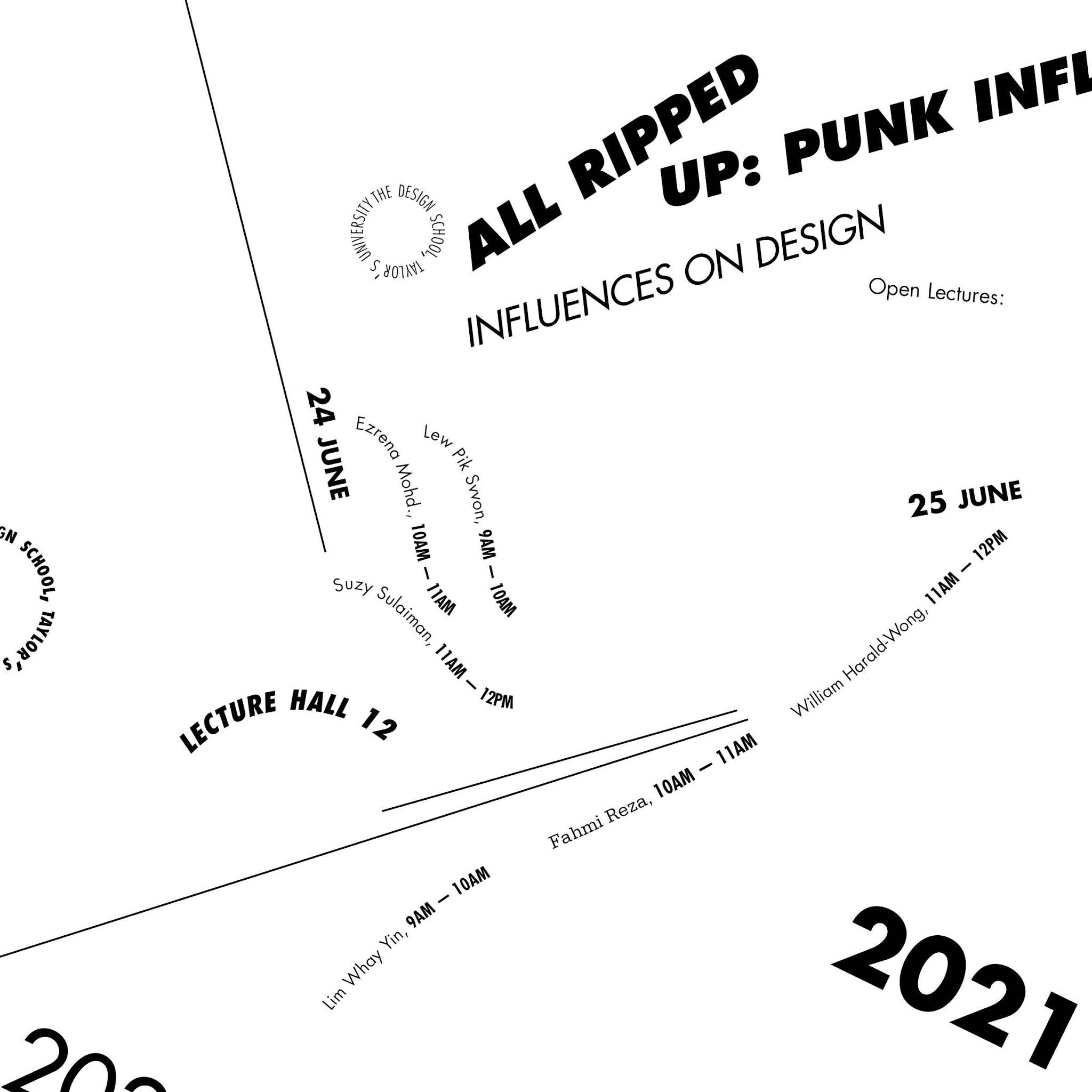

figure 2.9 Random System First Attempt
There were lots of typos in my works so I revised and finalized them along with the feedbacks given. These are the revised version:


figure 3.1 Top to Bottom: Axial, Radial, Dilatational, Transitional, Bilateral, Random (Revised)


figure 3.2 Top to Bottom: Columns And Grids (Grid And Modular)

figure 3.3 Grid System Revised

figure 3.4 Modular System Revised
We only need to submit each design for each system, these are what I picked:

figure 3.5 Axial System Final

figure 3.6 Radial System Final

figure 3.7 Dilatational System Final

figure 3.8 Grid System Final

figure 3.9 Transitional System Final

figure 4.1 Modular System Final

figure 4.2 Bilateral System Final

figure 4.3 Random System Final
figure 4.4 Typographic System Final PDF
Week 2 - Week 4 Type & Play: Finding Type
For our next exercise, we need to find an image to analyze, dissect and identify potential letterforms within the dissected image. I searched for a lot of images online since I don't really take pictures by myself. Here are my image choices:

figure 4.5 Picture 1

figure 4.6 Picture 2

figure 4.7 Picture 3

figure 4.8 Picture 4

figure 4.9 Picture 5
I ended up going with the picture from figure 5.7 because I found some interesting letters there. So without further ado, I started dissecting the picture in Illustrator.

figure 5.1 Original Image

figure 5.2 Dissection in Illustrator
The letters I found are uppercases of letters V, K, F, A, and Y.

figure 5.3 Letters Found
This is the original and zoomed version of the letters:

figure 5.4 Original Letters
After that, I did some corrections by fixing the length, width, and angle of the letters.

figure 5.5 Comparison Between Original (Top) and 1st Attempt (Bottom)
For the second attempt, I tried reducing the gap of the open counter in letters A, V, and Y. Also what I did was to start using the strokes from the letter V. The horizontal line for letter A is tilted because I want to stick to the original one.

figure 5.6 Comparison Between 1st (Top) and 2nd Attempt (Bottom)
Next, I made the strokes all consistent and all those bumpy shapes are gone.

figure 5.7 Comparison Between 2nd (Top) and 3rd Attempt (Bottom)
The difference here is I applied the same width to every letter, but it somehow turned as if I stretched the letter F, K so I decided to change it again. I also fixed the stroke for the vertical lines.

figure 5.8 Comparison Between 3rd (Top) and 4th Attempt (Bottom)
For the last attempt, I realized that the letter A looks better with bolder strokes so I applied it, still keeping the tilted horizontal. I also erased the horizontal line (2nd line) on the letter F because I want it to look similar to the original.

figure 5.9 Comparison Between 4th (Top) and 5th Attempt (Bottom)
After the feedback given by Sir, I added some of the leaf's shape and combine them together with the letterforms.

figure 6.1 Comparison Between 5th (Top) and 6th Attempt (Bottom)
I find it weird placing the leaves there so I changed the placing by playing around with them.


I figured to stick on placing the leaves to the intersections, however, the letter K looks crowded now.

figure 6.5 Final Result

figure 6.6 Final Letter 'A'

figure 6.7 Final Letter 'V'

figure 6.8 Final Letter 'Y'

figure 6.9 Final Letter 'F'

figure 7.1 Final Letter 'K'
figure 7.2 Type & Play: Finding Type Final PDF
Week 5 - Type & Play: Type and Image
This week we started with our next task, Type & Image. We were given time in class to find images and incorporate the text with the image. Before that, I search for inspirations on Pinterest.


figure 7.3 Inspirations from Pinterest (19/04/21)
I found 3 images I wanted to work with.


figure 7.4 Images to Work With (19/04/21)
Since time is limited, I only came up with the sketches of 2 images. Here is what I sketched:


figure 7.5 Sketch of 'Woods' (19/04/21)


figure 7.6 Sketch of 'Wild' (19/04/21)
(I showed Sir Vinod the Sketch of 'Wild', the right image in figure 8.1)
But then, I changed the image I worked on because I think the candle (figure 7.8 - top left) image would work better since it has more things to play with. Here are the progress made:


figure 7.7 Progress in Photoshop (25/04/21)
Explanation on progress:
- Make a selection around the melted candle to make a displacement map
- Blurred + Adjusted the hue and saturation
- Added "LIGHT" text + Used displacement map + Changed text color
- Editing the melted word by using brush + smudge + blur
- Added 'UP' text + added glow + smudge
- Used Camera Raw Filter to adjust

figure 7.8 Attempt 1 (25/04/21)
After receiving feedback from my peers and Sir Vinod, I revised my work. However, this time I changed the program I'm using since I find it easier to make the effects. The steps were still the same except I didn't use a displacement map here.

figure 7.9 Final Result (27/04/21)
figure 8.1 Type and Image Final Result PDF
FEEDBACKS
Week 1 (Peer Feedbacks)
- Nice font choice
- Impactful tittle
- Overall looks nice, however, the location text is too near the title
Week 2 (General Feedbacks)
- Separate the spreads with a 0.5 pt line
- Separate the process and final
Week 2 (Specific Feedbacks)
- Reduce point size by 0.5 pt for numbers and reduce the spacing between dashes and numbers
- Instead of paragraph break use force line break to follow the leading
- Dilatational System designs have too many spaces
- Transitional System is not really showing
- Bilateral System looks interesting, and the Random System looks really great like a fine art
Week 2 (Peer Feedbacks)
- Lots of Typing mistakes
- Improve on the readability
- Transitional System too simple
- Make sure to align the texts
- Random System is nice, the rules of randomness are shown
Week 3 (General Feedbacks)
- Change into Tasks 1 - Exercises
- Use off-white background for the typographic systems to differentiate the white background at the blog.
- Do more lectures and further reading
Week 3 (Specific Feedbacks)
Try combining the leaves to the letterforms to have better characteristics.
Week 3 (Peer Feedbacks)
- Very consistent letterforms
- Too simplified
- Neat and good
Week 4 (General Feedback)
- Try asking yourself whether the design looks engaging or not.
Week 4 (Specific Feedback)
- Consistent (Letterform)
- Too plain, try playing with the depth of field, maintain the play of the weed, maybe the word choice is not precise, the interplay is there.
Week 4 (Peer Feedback)
- Looks consistent
- The shape of the leaves are not really showing, try using the full shape of the leaves.
Week 5 (General Feedback)
- Pay attention to the level of realness/seamlessness in the type.
Week 5 (Specific Feedback)
- Choice of typeface (serifs may work but try others)
- Use some kind of 3D effects for the text on the wax
- Try forming the text on the dripping wax
Week 5 (Peer Feedback)
- Try using san serifs
- Use a different color for 'LIGHT' to make them blend more to the wax
- Add texture.
FURTHER READING
Seven Essential Typographic Layout Systems (Lucas Czarnacki)

We needed to create 8 designs for the 8 variety of Typographic System so I stumbled upon this web called type365. It provides lots of books regarding Typography and from this book, we can learn how to create varieties for each of the systems. It is unfortunate that Random System is not concluded in this book.
1. Axial System: Symmetry, adjust column width, tilt, add non-objective elements, implicit vs explicit axis, and mess with the text.
2. Radial System: Adjust inner and outer edge, grouping, enclosure, and use non-objective elements.
3. Dilatational System: Vary the circle's centre, use multiple circles, varying the size of the circles, use non-objective elements, and add tangential circles.
4. Grid System: Visual fields (combining grid fields), and use text and graphics.
5. Transitional System: Apply movement, direction, and use non-objective elements.
6. Bilateral System: Use vertical and horizontal space, tilt, and use non-objective elements.
7. Modular System: Use any shape and non-objective elements.
In conclusion, all 7 systems can use a lot of different methods to create varieties of amazing designs.
Type Rules! The Designer's Guide to Professional Typography 2nd Edition (Ilene Strizver - 2006)

(pg. 57-58)
To understand more on how to choose the right typeface for the right job, I came upon this book which has materials on how to choose the right typeface. The first thing that needs to be done is to know our design goal, such as:
figure 1.1 Poster
The typeface used in this book cover screams out excitement, danger, and intrigue in conjunction with the illustration, one of the characteristics that define this typeface is the sharp edges.
Type Rules! The Desgner's Guide to Professional Typography 2nd Edition (Ilene Strizver - 2006)

(pg. 63-66)
Sometimes design cries out for a solution that blends type with illustration to get a concept across in a strong, nonverbal way. The use of typographic illustration and visual puns can be a clever, powerful, and useful tool for effective design.

figure 1.2 Lettering by Kayla Silber
The lettering by kayla Silber, as shown above, has a freeform, quirky, and dynamic lettering was designed to mimic the qualities of the artist’s music.

figure 1.3 Mohawk Paper promo by VSA Partners, Inc.
A clean, tasteful design results from contrasting script with slab-serif typeface, large with small, cap with lowercase, and black with color. Resulting in an elegant design.
Text & image, interplay & animation (Jason Pamental)

One of the most common and visually arresting techniques in graphic design is creating the illusion of interplay between text and image. To create the interplay what we can do is to search what's seldom seen.

figure 1.4 Interplay Between Cheer Squad and Letters
The letters interwined with the cheer squad.

figure 1.5 Interplay Between Flowers and Letters
The promotional poster to promote travel by Cussetti uses interplay. The way the flowers curl around the ‘P’ in Paris is subtle, but lovely.
REFLECTION
Week 1
Returning to typography after semester 1.5 made me almost forgot how to use InDesign and as usual, my very first day always comes with trouble, my Indesign was crashing so I had to re-download which takes a lot of time. Gladly, I made it in time for the peer feedback session. Typography has always amazed me with how words can be created in a lot of different and impactful ways. Typographic System is very new for me, so I still need to do a lot of reading to have a better understanding.
Week 2
I had a fun time in the breakout room for the evaluation session between peers, I was grouped with amazing people that gave me a lot of useful feedbacks which I can use to improve more. They were all very friendly too as we all are active when giving feedback. After the evaluation, I thought Sir Vinod will give us feedbacks one by one but it turns out he only calls out the one on his list, and surprisingly I was one of them. I was pretty nervous, but he pointed out my mistakes and even liked some of my works.
We need to start our 2nd exercise, and honestly, I completely forgot how to make letterforms so I looked at my old work. I had a fun time making the letterforms, I found my final one turns into a very simple one than the original one. Although I did get confused when forming the letter Y, it turns out fine after all.
Week 3
We had breakout rooms and I actually quite enjoy it because I feel more relaxed not feeling intimidated, the feedbacks my peers gave are also very useful and made me continue to work hard. After getting feedback from Sir Vinod, I immediately fixed my letterforms so I won't procrastinate.
Week 4
We had breakout rooms again to continue to have feedback on our revised letterform, the feedback session went well for me. After all that, Sir Vinod went to give feedback to some of us and gave tutorials on how to form the letter. When learning of the next task, I was pretty excited as we can use photoshop for that task, I knew I would have fun on this task.
Week 5
I found out that I'm still lacking when it comes to illustrating in Photoshop, I don't know if it's because I'm using a mouse, but I can't really blend in there. So instead, I went and use Procreate as I'm more comfortable with the tools. Both of the programs actually gave kind of a similar result, but in procreate I can blend more since I'm used to it. For photoshop, there are lots of useful tool such as the camera raw filter where I can adjust the colors afterwards.

Comments
Post a Comment