Design Principle : Final Project
30.10.2020 - 29.11.2020 (Week 10 - Week 14)
Jocelin Agustia (0345436)
Design Principle / Bachelor of Design (Hons) in Creative Media
Project 3 - Visual Analysis & Research

LECTURE


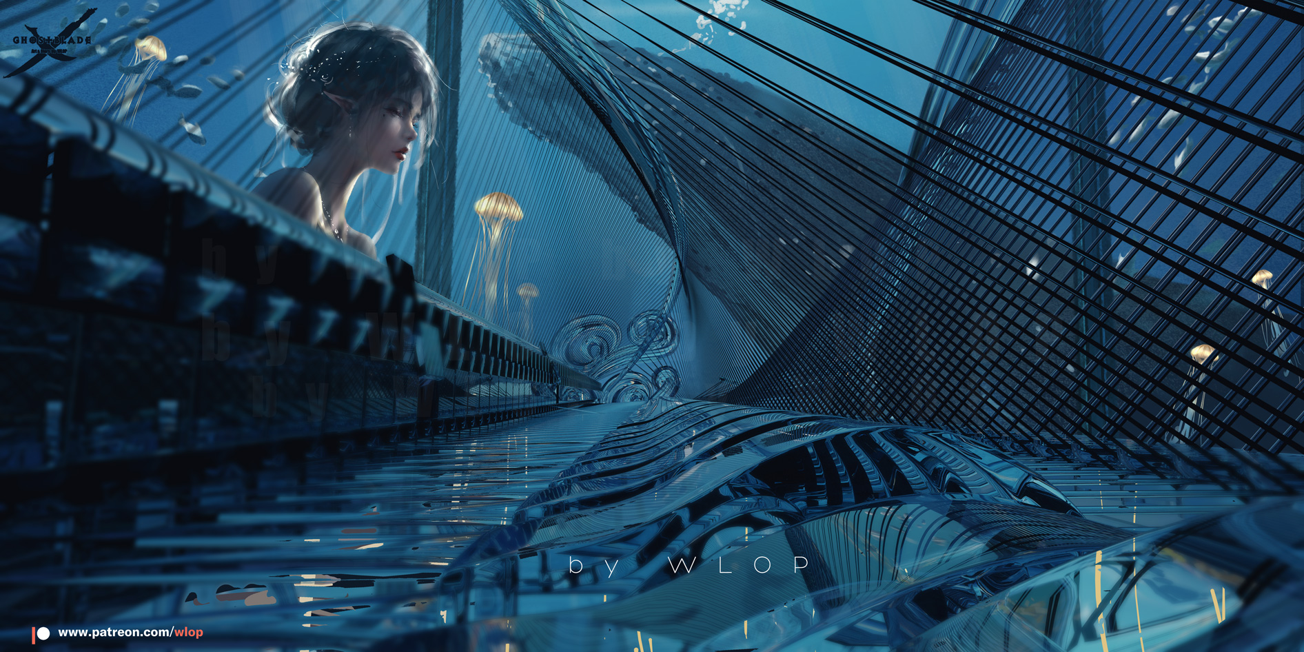
Piano by Wlop
Observation
Figure 1 - This illustration called ‘Piano” by Wlop is made in a landscape form; it has an interesting perspective view which is worm eye, eye bird view, and side view. The use of colors is simply from the same families, but it could create a very interesting illustration. Here he used many organic and geometric elements (lines, leaves, circle, tube, etc.).
Figure 2 - For the second angle, which is the eye bird view, it is also made in landscape form. With this angle, Wlop created the main focus to the character's hand and also he used a lot of organic and geometric elements (the piano's string and the shape of the piano).
Figure 3 - This third angle completely erases the character's body from view as we can only see the character's face and the inside of the piano. Wlop also uses many organic and geometric elements and the same family colors.
Analysis
Figure 1 - Since he created
this from the same color families, we could see that this creates harmony. Look
at how the fishes were together making those movements and merely creating a
sense of unity. The character’s hand also shows the movement of playing the
piano. With the piano‘s strings creating repetition. Overall, this artwork
could make us feel peaceful and calm.
Figure 2 - The second angle focuses more on the movement of
the character’s hands and also the details of the piano that is
formed by repetition. This angle also creates hierarchy as we, as the viewer
would look at this piece of artwork from the top and slowly moving to the
character’s movement.
Figure 3 - In this side view, we could see the character’s expression, calm and undisturbed as if this is her own private space. Movements of the jellyfish going up, and the fishes movement is wandering around the tank/aquarium.
I simply cannot take my eyes off
of this artwork. Truly beautiful.
Interpretation
This illustration is actually from one of his characters from the indie comic he made called “Ghost Blade”. This piece contains a pleasant feeling because one look at it we could already feel it, the character seems to be one with her surroundings. His style has always been this semi-realism style, but with 3D elements such as the piano, which was made by himself in blender, a 3D software. I do not find any of this piece in his comics, so I guess the purpose is to immerse viewers into his artwork. The more you look at it, the more impressive it gets. Besides that, I feel that his works could make people think just how amazing art is, as they can express sorts of feelings. Lastly, the detail of his drawing is just incredible.

Instructions


RATIONALE
REFLECTION

Comments
Post a Comment