Typography / Project 2A - Font Design
06.10.2020 - 20.10.2020 (Week 7 - Week 9)
Jocelin Agustia / 0345436 / BDCM
Typography
Project 2A - Font Design
LECTURE: Screen and Print
Typography / Different Medium: Print Type Vs Screen Type
Type for print
Designed intended for reading from print. Typefaces like Caslon, Garamond, Baskerville are the most common typefaces that are used for prints because of their characteristics which are elegant and intellectual but highly readable in small font size. Type for prints is versatile, easy-to-digest, which has neutrality and versatility that makes typesetting with it a breeze.
Type for screen
Optimized and often modified to enhance readability and performance onscreen in a variety of digital environments. This could include a taller x-height, wider letterforms, more open counters, heavier thin strokes and serifs, reduced stroke contrast, as well as modified curves and angle for some degrees. Another important adjustment for typefaces intended for the smaller size is a more open spacing, this is to improve character recognition and overall readability.
Hyperactive Link/Hyperlink
Hyperlink is a word, phrase, or image that we can click on to jump to a new document or a new section within the current document. Hyperlink texts are often in blue and underlined.
Font size for screen
16 pixel text on screen is about the same size as text printed in a book or magazine.
System fonts for screen/ Web Safe Fonts
Web safe fonts are fonts that appears across all operating system. They're the small collection of fonts that overlap from Windows to mac to Google. Examples: Open Sans, Lato, Arial, Helvetica, Times New Roman, Times, Courier New, Courier, Verdana, Georgia, Palatino, Garamond, etc.
Pixel differential between devices
the screens used by our electronical devices are not only different sizes but the text differs in proportion too because they have different sized pixels.
figure 1.1 Pixel Differential
Static Vs Motion
figure 1.2 Static Vs Motion
Static typography
Has minimal characteristic in expressing words. From billboards to posters, magazines, to fliers, we encounter all forms of static typography with wide ranging purposes.
Motion Typography
Type is often overlaid onto music videos and advertisements, often set in motion following the rhythm of a soundtrack. Developed to become expressive, helping establish the tone of associated content or express a set of brand values. The typography must also prepare the audience for the film by evoking a certain mood.
INSTRUCTIONS
figure 1.1 Letter 'I' Dissection (05/10/2020)
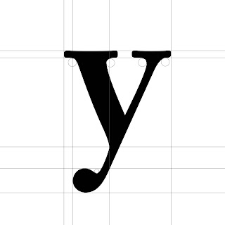
figure 1.2 Letter 'y' Dissection (05/10/2020)
figure 1.3 Letter 'a' Dissection (05/10/2020)
We had a rapid feedback section on week 8 and so I made changes after receiving the feedback.
figure 1.8 Attempt 2 JPG (19/10/2020)
figure 2.2 (Before Week 9 Feedback) Poster JPG (19/10/2020)
FEEDBACKS
Week 8
I need to fix the letter a, b, d, g, and e. letter b and d have vertical stress while the letter g needs to be in the same x-height. The letter e needs to be closer and look like the letter p. Lastly, the thickness of the letters must be increased.
Week 9
Increase the weight stroke and fix the letter m, try using font lab to have more consistent lines.
REFLECTION
Experience
I was clueless when dissecting the letters but I know that to dissect the letter we need an understanding of letters anatomy and I went to a senior's blog to see how he did it.
Observations
Although what the senior had done doesn't give a step by step of how to dissect, I think I have gotten a gist of it and tried to do it myself with the letters I picked. The design I made for the font was actually pretty simple, but I had a hard time adjusting some letters like m and y.
Findings
Not too sure, but I guess if you lack understanding of the anatomy you can't do anything and it will just confuse you. So before making my own typeface I must be sure to review again. I always forgot to duplicate the letter before merging, so it is quite frustrating when I need to fix them, I should make sure to remember next time.
FURTHER READING
I am always confused about what is the difference between typeface and font. So I searched for a little bit.
What is the Difference Between A Font And A Typeface? (Filipa Amado)
Source: https://snowball.digital/blog/what-is-the-difference-between-a-font-and-a-typeface
The main difference between these two terms is that a typeface is the name of a specific collection of related fonts. While font refers to a particular weight, width, and style within that typeface. To put it in simple terms, each variation of a typeface is a font. For example, Helvetica would be the typeface chosen for a project, but the actual font in use might be Helvetica Regular 9 points. So, that means the variations are called font while the type itself is a typeface, like the main.
A font is merely a document you install that allows you to use a particular typeface. The word font now refers to the style and the look.


Comments
Post a Comment