Typography / Task 1 : Exercises
25.8.2020 - 22.9.2020 (Week 1 - Week 5)
Jocelin Agustia / 0345436 / BDCM
Typography
Task 1 Exercises

LECTURES
Week 1: Introduction and Briefing
Typography is our second class, we were introduced to our lecturers, Mr. Vinod and Mr. Shamsul. Mr. Vinods taught us how to make the blog for our classes step by step. There are 5 parts to this blog; Lectures, Instructions, Feedback, Reflection, and lastly, Further Reading. Then, he gave us our first assignment and made a poll for us to vote. We were also told to download the 10 type families that are going to be used in our design.
- Bang!
- Bloom
- Twirl
- Tired
- Mad
- Hug
Mr. Shamsul taught us many things that are useful for our assignment. Many shortcuts were explained to us.
- Ctrl + Alt + 2 = Unlock
- Ctrl + 2 = Lock
- Select + Shift = Select Multiple Objects
- Ctrl + G = Group
- Ctrl + Shift + G = Ungroup
- Ctrl + (+) = Zoom In
- Ctrl + (-) = Zoom Out
- Space bar = Hand tool
- Ctrl + T = Character Window
- Alt + Left Arrow = Kerning
- Alt + Right Arrow = Letter spacing
Lecture 2: Development
Early Letterform Development: Phoenician to Roman
During this time, writing basically means scratching into wet clay with a sharpened stick or carving into stone with Chisel. The tool that is used is essential for how our writing could turn out. At this time, the uppercase letters are a simple combination of straight lines and pieces of circles.
The Greeks changed the direction of writing called Boustrophedon (how the ox plows). The lines of texts are read alternately from left to right and left to right. In this case, we need to be fluent i=on reading the alpj=habets as they are also flipped.
Etruscan (Then Roman) painted letterforms before inscribing them. From their strokes, we could see certain qualities such as a change in weight from vertical to horizontal and the broadening of strokes at the start and finish.
Hand script from 3rd - 10th Century C.E
Square capitals have serifs added to the finish of the main strokes, and to create the letters, a reed pen is held at an angle of approximately 60° off the perpendicular.
Late 3rd - mid 4th Century (Rustic capitals, more condensed letters)
Uncials incorporated some aspects of the Roman cursive hand, especially in the shape of A, D, E, N, M, U, and Q.
Charlemagne is the first unifier of Europe since the Romans issued an edict to standardized all ecclesiastical texts.
Blackletter to Gutenberg's Type
A condensed letterform (Blackletter) strongly is popular in Northern Europe after the dissolution of the Charlemagne Empire. Gutenberg's skills included engineering, metalsmithing, and chemistry. He then marshaled them all to build pages that accurately mimicked the work of the scribe's hand - Blackletter of Northern Europe.
Text Type Classifications
Typeforms are developed in response to prevailing technology, commercial needs, and esthetic trends.
- 1450 Blackletter: Earliest printing type. e.g., Closter Black - Goudy Text
- 1475 Oldstyle: Based on the lowercase forms used by Italian Humanist Scholars. e.g., Bembo, Palatino, Caslon, etc.
- 1500 Itallic: Echoing contemporary Italian handwriting
- 1550 Script: Replication of engraved calligraphy forms. e.g., Mistral, Kuenstler scripts, Snell Roundhand.
- 1750 Transitional: A refinement of Oldstyle forms. e.g., Century, Times Roman, Bulmer, etc.
- 1775 Modern: Further rationalization of Oldstyle. e.g., Bell, Bodoni, Didot, etc.
- 1825 Square Serif/Slab Serif: Heavily bracketed serif with little variation between thick and thin strokes. e.g., Clarendon, Memphis, Serifa, etc.
- 1900 San Serif: Elimination of Serifs altogether. e.g., Futura, News Gothic, Helvetica, etc.
- 1990 Serif/Sans Serif: Includes both Serif and Sans Serif alphabets. e.g., Rotis, Scala, Stone.
Lecture 3: Basic
Typography employs several technical terms, mostly describe specific parts of the letterforms.

figure 1.1 Letterforms component parts
Baseline: The imaginary line, the visual base of the letterforms
Median: The imaginary line defining the x-height of the letterforms
X-height: The height in any typeface of the lowercase 'x'
Stroke: Any lines that define the basic letterform
Apex/Vertex: The point created by joining 2 ) diagonal stems (apex; above, and vertex; below)
Arm: Short strokes off the stem of the letterforms (could be horizontal, vertical, and upwards)
Ascender: The portion of the stem of a lowercase letterform that projects above the median
Barb: The half-serif finish on some curved stroke
Beak: The half-serif finish on some horizontal arms
Bowl: The rounded form that describes a counter (either open or closed)
Bracket: The transition between the serif and the stem
Crossbar: The horizontal stroke in a letterform that joins 2 stems together
Cross strokes: The horizontal stroke in a letterform that joins 2 stems together
Crotch: The interior space where 2 strokes meet
Ear: The stroke extending out from the main stem or body of the letterform
Em/En: Width of an uppercase M. An Em is now the distance equal to the size of the typeface and an En is half size if an Em.
Finial: The rounded non-serif terminal to a stroke
Leg: Short stroke off the stem of the letterform, either at the bottom or inclined downward
Ligature: The character formed by the combination of 2 or more letterforms
Stress: The orientation of the letterform indicated by the thin stroke in round forms
Swash: Flourish
The Font

figure 1.2 Uppercase and Lowercase letter
Uppercase: Capital letters
Lowercase: lowercases letters

figure 1.3 Capitals
Small Capitals: Mostly found in serif fonts as part of what is often called expert set.

figure 1.4 Uppercase Numerals and lowercase Numerals

figure 1.5 Italic

figure 1.6 Punctuation, miscellaneous characters

Describing typefaces

figure 1.8 Roman
The letterform is called Roman because the uppercase forms are derived from inscription of Roman monuments. A slightly lighter stroke in Roman is known as 'Book'

figure 1.9 Italics Oblique
Italics are named for fifteenth-century Italian handwriting on which the forms are based on. While Oblique is conversely based on the roman form of the typeface.

figure 2.1 Boldface
Boldface is characterized by a thicker stroke than a roman form. It can also be called 'semibold', 'medium', 'black', or super depending on the relative stroke widths. In some typefaces, the boldest is called 'Poster'.

figure 2.2 Light
A lighter stroke that the roman form, the even lighter ones is called 'thin'.

figure 2.3 Condensed
A version of Roman form and extremely condense styles are called 'compressed'.

figure 2.4 Extended
Extended variation od a roman form.
Lecture 4: Text Part 1
Text/Tracking: Kerning and Letterspacing
Kerning: Automatic adjustment of space between letters
Letterspacing: Add space between letters
tracking: addition and removal of space in word or sentence
When increasing or decreasing letter spacing between words or sentences it means that the recognizability of these letterforms is reduced. Many good typography designers avoid letter-spacing lowercase words because unlike uppercase letterforms, they are not able to stand on their own as they require the counter form created between letters to maintain the line of reading.
Text/Formatting Text
1. Flush left: Closely mirrors the augmented experience of handwriting (left to right) and has a ragged right.
2. Centered: Symmetry upon the text and is ragged right and left
3. Flush right: Places emphasis on the ned of a line opposed to its star, useful in captions, and has a ragged left.
4. Justified: Imposes symmetrical shape between words and sometimes between letters.
For a more readable format, the flush left is more recommended.
When setting the field of type, we need to keep in mind what the typographer's job is - clear, appropriate presentation on the author's message, and we need to strike on balance. Tips when designing is when you see the type first, change it. And never use capital letters in script typefaces.
Text/Texture
Typefaces also have a certain feel to it, so it is important when choosing the right typeface because they can deliver messages.
Text/Leading and Line Length
The goal of setting text type is for easy and prolonged reading.
Type size: Large enough to be read when at arm's length
Leading: Do not set the text too tightly or loosely
Line length: Shorter lines require less leading while longer lines need more. A good tip is to keep the line between 55-65 characters.
Text/Typespecimen Book
There are many samples of typefaces in a various different sizes to provide an accurate reference for type, type size, type leading, type line length, and etc.
Lecture 5: Text Part 2
Text /Indicating Paragraphs
- Pilcrow (¶): A holdover from medieval manuscripts that are used to indicate paragraphs space
- Linespace (leading): Used to ensure cross-alignment across columns of text. Do not enter to make new paragraphs, instead, we could change its value in InDesign.
Line Spacing Vs Leading
Line space: Space from one descended to another descended between the text
Leading: A space that is put between texts
- Indentation: To save space (especially used in Newspapers). Remember to use justified alignment not left alignment.
- Extended Paragraphs: Creates unusually wide columns of text. Used in academic writings.
Text/Widows and Orphans
Widow: A short line of type left alone at the end of the column text.
Orphan: A short line of type left alone at the start of a new column.
Widows and Orphans need to be avoided especially for large amounts of text like in magazines, newspapers, journals, and etc. To avoid this kind of problem, we could always reduce the column height/weight.
Text/Highlighting Text
There are various of ways to highlight texts:
- Italic text
- Bold text
- Changing the typeface and make it Bold
- Changing the color of the text (Only Cyan, Magenta, and Black is allowed)
- Creating a box around the text
- Use typographic elements like bullets
- Using Quotation marks
As a reminder: ('/") A straight quote is not a quotation mark, it is called prime, this is often mistaken but a good typographer needs to know that it is a symbol used to indicate feet/inches.
Text/Headline with Text
To avoid confusion in reading, we need to be able to decide on the hierarchy information such as Headlines, Sub Headlines, and Sub-sub Headlines.
Text/Cross Alignment
Cross alignment is used to reinforce the architectural sense of the page-the structure-while articulating the complementary vertical rhythms.
INSTRUCTIONS
Week 1
figure 2.5 Module PDF
The first exercise is to use the 10 Type Families to create the words that we have chosen from the top 6. I chose Bang!, Bloom, Tired, and Twirl. This is actually a challenge for me. It is going to be my first time using Adobe Illustrator. For this week, we were told to do our sketches first.

figure 2.6 Scanned Sketches (26/08/2020)
After some sketches, I decided to digitize them by picking, which I think is the best. And here is the result.

figure 2.7 Type Expression 1 Attempt (30/08/2020)


2.9 Type Expression Final Attempt JPG (01/09/2020)
figure 3.1 Type Expression PDF (01/09/2020)
Week 2

figure 3.2 Twirl GIF (07/09/2020)
figure 3.3 Twirl GIF in PDF (07/09/2020)

figure 3.4 Revised and Final GIF (08/09/2020)
figure 3.5 Revised and Final GIF in PDF (08/09/2020)
Week 3
This week we will work with text formatting, these are the tasks:
1. Type your name in a box and choose a suitable typeface
2. Create a name card using text formatting
3. Create 100-200 words for text
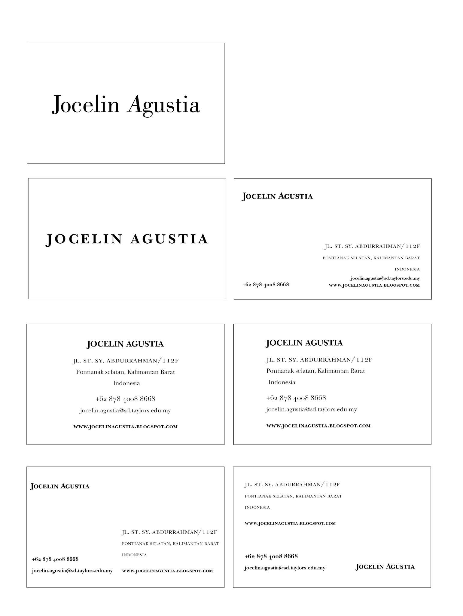

figure 3.6 Text Formatting JPG (14/09/2020)
figure 3.7 Text Formatting PDF (14/09/2020)
For this task, I first made 2 boxes with different typeface and adjusted them. For the first one I used Bodoni Std - Book and skewed the letter A for a bit, for the second I used ITC New Baskerville Std - Bold and adjusted the kerning and letterspacing and turn the letter into small caps.
Week 4
We were told to go to the Kreatif Beats webpage to copy and paste the articles there and use them as our task. Today we have 2 formatting text tasks.

figure 3.8 Columns and Rows (17/09/2020)


figure 3.9 Formatted Texts (17/09/2020)
figure 4.1 Formatted Texts PDF (17/09/2020)


figure 4.2 Final Text Formatting JPG (21/09/2020)
figure 4.3 Final Text Formatting PDF (21/09/2020)


figure 4.4 Final Formatted Texts JPG (21/09/2020)
FEEDBACK
Week 1
No feedback yet, the first week of online class.
Week 2
Today we had our works evaluated, the lecturers help and give us opinions about what need s to be revised from our design one by one. When it is my turn, they told me that the word 'Tired" needs to be made horizontal. One of the words "Bang!' needs to be highlighted and I should ignore the drop shadows. For 'Twirl" and 'Bloom", it is said that those words need to be improvised.
We were then given time to revise our design, after the break ends Sir Vinod started to evaluate our works again. Mine still needs more improvisation. I was told to make the font for "Twirl" smaller, the line weight for "Bloom' needs to be 0.5 and lastly my 'Tired" doesn't need shadows.
Week 3
Mr. Vinod and Mr. Shamsul looked at our animation today. For my animation, I was told that it is too simple so I need to revise it because it doesn't have a big impact to it, they told me to make a kind of like the DNA movements and the animation doesn't need to stick to the design I made, I could change where it starts and also extend the twirl because it doesn't matter, it is okay to enhance it.
Week 4
No feedback, only demonstration of formatting text.
Week 5
For the exercises, I was told that my name is too tight and I have a problem regarding the choice of typeface and point sizes. There are also some unnecessary small capitals for the text and I need to fix my tracking and kerning for the texts and pay attention to the ragging.
REFLECTION
Experience:
Week 1
Online classes are actually quite an exciting experience. But it seems that it's not as exciting as I hoped. It is even better to have face to face classes where it would be easier to interact with the lecturers and friends. I actually had a hard time with online classes. Well, for the lecture with Mr. Vinod and Mr. Shamsul, it is actually pretty relaxing, and there is no problem along the class. We were also given the recorded video so we could watch them again for our future needs.
Week 2
Every design I made takes a lot of time, especially for Bloom. I find it hard to design because when I finally thought of a good design and sketched it out, it seems to simple. But I have a lot of fun when designing the 4 words because I can also sharpen my imaginations.
Week 3
When choosing what word to animate, I didn't really have ideas of how to animate them. So I watched the video in the group and also watched some videos on Youtube. Then I chose Twirl to animate, I had a good idea of how to animate it, but after animating it, it took too many frames, and when I tried to convert it into GIF error happened and I can't save the animation. Then I reduce the frames but the idea also changed into a simpler one.
Week 4
The lecture for this week is very useful for me because Sir Vinod demonstrated the process of formatting text and even told us a few new terms, like widows and orphans. We were given the first task and given time to finish it within the time given.
Week 5
We had a feedback session today so I learnt a lot from when Sir Vinod gives feedbacks to the others and me, I also fixed some of my texts when Sir was giving feedbacks.
Observation:
Week 1
I thought typography would be easy, as it just words. However, after understanding deeper about this topic, I find myself overwhelmed. I didn't know that there was so much to typography, and it is actually very challenging to make the right typeface. I spent hours and hours just to design those non-meaningful words into words that we could understand the action only by looking at the text.
Week 2
For this task, I need to know the meaning of each word to emphasize them, so I searched online and studied them briefly. Although understood, it is still hard to make a good design. It took me 2-3 days to come up with designs I am satisfied with.
Week 3
It takes a lot of time just to animate a simple animation, and to make the animation smooth it even takes a lot of frames. At first, I have around 70 frames but then because of an error, I reduced it into around 30 frames.
Week 4
When being explained to, I can absorb the explanations well but when we were told to do the first task during class, I panicked a little and my mind went blank for a while. But after that, I could do the task, although the text is a bit long and takes some time I managed to adjust them.
Week 5
When Sir was giving feedbacks I checked my own work and I find that there are some mistakes to it so I quickly change them but I still find difficulties especially for the very long text that we were told to follow last week.
Findings:
Week 1
Adobe Illustrator's pen tool is tough to use for a beginner like me. When I first played Bezier Game, I thought that it would be easy, but after doing it by myself, it is actually really hard. And I still don't really understand how Illustrator works, so I hope I could get better with more practice.
Week 2
I had struggles when editing my works, but it was still OK. At least I got used to some shortcuts to help me finish my work faster.
Week 3
It is not my first time animating, but I find animating words hard because it needs to make sense to the word I chose. I use Procreate to do animations so I find it a lot easier than using Illustrator and Photoshop since it's my first time animating. Also, now I understand what fps is.
Week 4
Formatting text is not that easy, at first, I thought that it will take a short time but after demonstrating it by myself, I find that it needs a long time to adjust them. We also need to be precise and look at a bigger picture so we could be satisfied with the formatting.
Week 5
Widows and Orphans are difficult to fix, I need to force break some words but I need several tries to it. There are also some ragging that doesn't feel right but can't be helped because I can't change anything anymore and I have tried several time.
FURTHER READING
Week 1
For this week, I decided to read this book called Typographic Design: Form and Communication by Rob Carter.
Typographic Design: Form and Communication (Carter, Rob., 2015)

There are many things to take notes in this book. This book even provided us with the evolution of Typography. But I just skimmed through it and continued to read deeper into the Historical Classification of Typefaces.
Old Style

figure 3.3 Old Style
Francesco Griffo is a worker who worked for the famous Venetian scholar-printer, Aldus Manutius. This Old Style all began from him, the capitals were influenced by carved Roman means, and lowercase letters were inspired by 15th-century humanistic writing styles. Old Style letterforms have the weight stress of rounded forms at an angle, just like in handwriting. The serifs are brackets, and the top serifs on the lowercase letters are at an angle.
Italic

figure 3.4 Italic
This is a typeface that slants to the right. It is mainly used for emphasis and differentiation. At the time, the first italic words were close-set and condensed. Therefore Manatius was able to get more words on each line. The Italic styles are based on handwriting with connected strokes and are all scripts.
Transitional
figure 3.5 Transitional
Transitional characters are usually wider than Old Style, it has a contrast between thick and thin strokes. John Baskerville made this typeface during the 1700s, where typefaces evolved from Old Style to Modern. Lowercase serifs are more horizontal, and the stress within the rounded forms shifts to a less diagonal axis.
Modern

figure 3.6 Modern
This style reduced te thick strokes into hairlines, the weight stress of rounded character is vertical. The uppercase width is regularized. Wide letters such as M and W, are condensed while the other letters, including P and T, are expanded. Modern style typefaces have a strong geometric quality.
Egyptian
figure 3.7 Egyptian
Egyptian has heavy square or rectangular serifs that are usually unbracketed, and it is often minimal in the stress of curved strokes. Some slab serif typefaces even have the same strokes and weight.
Week 2
Type designers use these variations to create a family of typefaces:

figure 3.8 Serifs
Serifs provide some of the most identifiable features and in some cases reveal clues about their evolution.

figure 3.9 Weight
The feature is defined by the ratio between the relative width of the strokes of the letterforms and their height.

figure 4.1 Width
Expression of the ratio between the black vertical strokes and the intervals of the white between them.

figure 4.2 Posture
Romans letters that slant to the right but are the same as upright roman letters are called oblique, italics are letters based on handwriting. While the script is italic letters with connecting strokes.

figure 4.3 Thick/thin Contrast
This refers to the relationship between the thinnest part of the stroke and the thickest part.

figure 4.4 x-height
Based on the height of lowercase letters without ascender or descenders.

figure 4.5 Ascenders/descenders
They may appear longer or shorter in different typefaces depending on the relative size of their x-height.

figure 4.6 Stress
The prominent visual axis resulting from the relationships between thick and thin strokes may be left angled, vertical, or right-angled.
Week 3
Today we had a Troublemaker's Assembly which topic is about "How to not kill your brain". The speakers were Ms. Naseer, Ms. Jinchi, and Sir Vinod. For this assembly, everything discussed is about health and the brain. There are 3 important things to do to have a healthier brain, which are:
1. Eat Well
2. Sleep Well
3. Exercise regularly
We must do all those mentioned to avoid holes in our brains. They also discussed the questions from viewers. Surprisingly, there is something new I learned from this assembly, it is said that outgoing people tend to die faster, it was truly shocking. But it makes sense if the person minds nothing. At last, we had this test to test the state of our brains. Apparently, most of the viewers have a very poor brain, including me.
It was a fun session!
Week 4
Design Elements: Typography Fundamentals (Kristine Kullen)

To start out do begin with a quality typeface. For example, Helvetica is one of the typefaces that is proven to be effective over time. Sometimes one typeface is not enough and so creating broader typeface pallets come in handy.

Pairing one serif and san serif typeface works in most situations Remember, contrast is key. It is important to check the features of the typeface such as the letterform proportion, x-height, stroke quality, and stress. Typefaces with similar x-heights and counters mix nicely. For example, typefaces with double story characters (lower case a and g) might pair better than one face with them, the other without. Another important thing to remember when mixing typefaces is to choose faces that includes small caps and multiple numeral sets and lastly avoid redundancy.
Week 5
Design Elements: Typography Fundamentals (Kristine Kullen)

The example of bad mixing typefaces is to use the same category of typefaces. When mixing typefaces, a distinction between them is vital. The main point is to distinguish them. Serif Filosofia and san serif Gotham are the dominant typefaces. Bodoni and Univers unite in identity materials. Bodoni poised setting emphasizes the typeface attributes of high stroke contrast and majestic majuscules.
Using Century Schoolbook and Scala Sans is good for distinguishing the book's title and author's name.
Comments
Post a Comment